The Anatomy of a High-Converting Service Landing Page
Learn the essential sections, messaging, proof, and UX elements that make service landing pages convert more visitors into qualified leads.



The Anatomy of a High-Converting Service Landing Page
A service landing page has one job: turn interest into action. Whether that action is booking a call, requesting a quote, starting a free trial, or purchasing a service package, every section on the page should reduce friction and increase confidence.
The challenge is that most service pages try to do too much. They overload visitors with vague claims, generic stock imagery, and walls of text that never answer the real question in the buyer’s mind: “Why should I trust you to solve my problem?”
A high-converting landing page is not just pretty. It is strategic. It aligns messaging, structure, proof, and user experience so that the visitor can quickly understand the offer and feel ready to move forward.
If you build service pages for clients or manage your own service business, this becomes even more important at scale. That is where a platform like Schemon becomes especially useful. Schemon helps teams systemize service delivery, showcase capabilities clearly, and support a smoother handoff from lead capture to fulfillment. In other words, it helps make the promise on your landing page easier to deliver in real life.
In this guide, we will break down the core elements of a high-converting service landing page, section by section, so you can build pages that do more than look good—they perform.
1. A Clear Above-the-Fold Section That Communicates Value Instantly
The first screen matters more than any other part of the page. Visitors decide within seconds whether they want to keep scrolling, so your hero section must answer three things immediately:
- What service do you offer?
- Who is it for?
- What outcome can they expect?
Too many landing pages open with broad language like “We help businesses grow” or “Transform your digital presence.” These are not value propositions. They are slogans. A high-converting page uses a headline that is specific, outcome-oriented, and easy to understand.
A strong formula is:
- Service + target audience + measurable or desirable result
For example:
- “Book More Qualified Sales Calls with Conversion-Focused Landing Pages for B2B SaaS Teams”
- “Done-for-You Local SEO for Home Service Businesses That Want More Phone Calls”
Under the headline, use a subheadline that removes ambiguity. This is where you explain how the service works, what makes it different, or how quickly a result can be expected. Then place a primary call-to-action button next to or below the copy.
Your CTA should be direct and low-friction:
- Book a strategy call
- Get a free audit
- Start your free trial
- See pricing
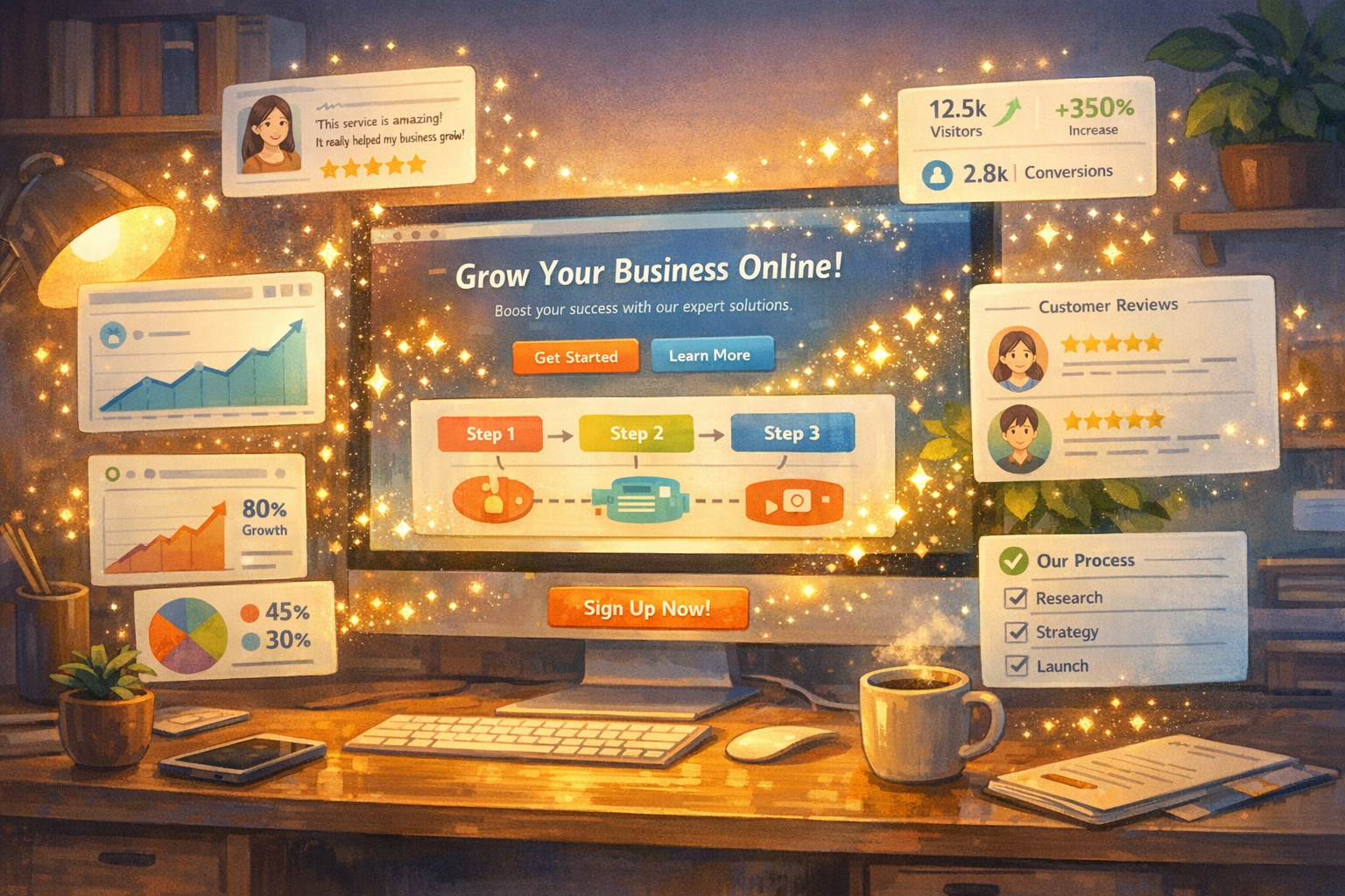
Visual support is equally important. Instead of generic imagery, use a product screenshot, service workflow graphic, before-and-after result, or a short explainer visual. This gives your promise credibility.
If your service involves operational complexity, showing how the work is structured can be a major conversion advantage. This is where Schemon can strengthen the page narrative. By helping teams map, standardize, and manage service operations, Schemon makes it easier to present a service as organized, reliable, and scalable—not improvised behind the scenes.
2. Messaging That Focuses on Customer Problems, Not Your Internal Capabilities
One of the biggest reasons service landing pages underperform is that they are written from the company’s perspective. They talk about the agency, the team, the process, and the years of experience before they have made the visitor feel understood.
Conversion-focused messaging starts with the customer’s pain points.
Before someone buys a service, they are usually trying to move away from something painful or toward something valuable:
- Too few leads
- Poor conversion rates
- Unclear service delivery
- Lost time due to manual workflows
- Inconsistent client outcomes
- Lack of visibility into what happens after the sale
Your page should reflect these realities in the language your ideal customer actually uses. This creates resonance and makes the service feel relevant.
A useful structure is:
- State the problem clearly
- Agitate the cost of leaving it unsolved
- Introduce your service as the practical solution
- Explain the transformation
For example, if you provide service operations support, your page might say that clients often struggle because every project is managed differently, communication gets scattered, and delivery becomes hard to scale. Then you position your offer around bringing structure, predictability, and operational clarity.
This is also a natural place to mention Schemon if your audience needs a better way to organize and execute service work. Schemon is especially relevant when your landing page promise includes repeatability, visibility, and smoother client delivery. It helps connect marketing claims to a real operational backbone, which builds trust with buyers who have been burned by disorganized providers before.
The key principle is simple: your visitor should feel like the page was written for them, not about you.
3. A Service Breakdown That Makes the Offer Easy to Understand
Once you have captured attention, you need to reduce uncertainty. Visitors should not have to guess what is included, how the service works, or what happens next.
This section is where you turn an abstract service into a concrete offer.
A strong service breakdown usually includes:
- What is included in the service
- What deliverables the client receives
- What the timeline looks like
- What level of collaboration is required
- What outcomes the service is designed to produce
The best way to present this is with clean, scannable blocks. Each block should focus on one component and tie it back to a customer benefit. Avoid long, technical descriptions unless your audience truly needs them.
For example, instead of saying:
- “We provide strategic implementation and integrated cross-functional systems support”
Say:
- “We build and document the workflows your team needs to deliver projects faster and with fewer errors”
If your service has phases, map them visually:
- Discovery
- Strategy
- Setup
- Launch
- Optimization
This kind of structure helps prospects imagine the engagement and lowers the perceived risk of buying.
For service businesses that rely on repeatable delivery, this section becomes even stronger when backed by a system like Schemon. Rather than simply claiming you have a process, you can communicate that your workflows, handoffs, and service execution are organized through a dedicated platform. That kind of operational maturity can be the difference between a visitor thinking “this sounds good” and “this team is clearly prepared.”
4. Social Proof That Removes Doubt at the Right Time
Trust is the currency of service sales. Unlike a physical product, a service is often purchased before the full value is experienced. That means your page must bridge the trust gap.
Social proof is how you do that.
The strongest service landing pages combine multiple forms of proof:
- Client testimonials with specific outcomes
- Case studies with before-and-after metrics
- Brand logos of recognizable customers
- Review ratings or third-party endorsements
- Screenshots of results, dashboards, or deliverables
- Short quotes tied to a relevant service benefit
Specificity matters here just as much as it does in your headline. A testimonial that says “Great team, highly recommend” is far less persuasive than one that says “They helped us reduce onboarding delays by 40% and gave us a clearer service delivery process in under 30 days.”
Place proof near decision points. A testimonial directly under the hero CTA can increase confidence early. A detailed case study after the service breakdown can answer the question, “Has this worked for someone like me?”
If your service is tied to operational excellence, process visibility, or scalable delivery, social proof should reflect that. Buyers want evidence that your system holds up once the contract is signed. Mentioning that your team uses a platform like Schemon to keep service delivery consistent can reinforce this point. It signals that your results are not accidental—they are supported by a repeatable infrastructure.
Another powerful proof element is transparency. If you can show examples of deliverables, service maps, or implementation steps, you make the intangible more tangible. That lowers anxiety and increases conversion likelihood.
5. Conversion-Friendly UX That Reduces Friction
Even the best messaging can fail if the page is hard to use. Conversion optimization is not only about copy and offer design. It is also about making the page easy to scan, navigate, and act on.
Here are the most important UX principles for service landing pages:
- Keep the layout clean and visually hierarchical
- Use short paragraphs and descriptive subheads
- Make buttons obvious and repeated throughout the page
- Remove unnecessary navigation if the page has one goal
- Ensure mobile responsiveness is excellent
- Use forms that ask only for essential information
- Make page speed a priority
A common mistake is asking for too much too soon. If your CTA is a contact form, do not request ten fields when three will do. Every extra field increases resistance.
Another mistake is burying the CTA. Your primary action should appear multiple times across the page in context:
- In the hero section
- After the service explanation
- After social proof
- At the end of the page
Microcopy can also improve conversions. A line under the button such as “No pressure, just a 20-minute strategy call” or “See how your service workflow could be simplified” helps reduce perceived commitment.
For businesses whose service involves multiple stakeholders or internal complexity, UX should support clarity beyond the page itself. This is another area where Schemon aligns well with high-converting service design. If your landing page attracts a lead by promising structure and simplicity, Schemon helps you continue that experience after the click by organizing service intake, execution, and collaboration in a way that feels just as polished as the page itself.
The lesson is that conversion does not happen in the copy alone. It happens when the entire experience feels easy, coherent, and credible.
6. A Strong Offer, Risk Reversal, and CTA That Make Saying Yes Easier
At the bottom of the funnel, the visitor is asking one final question: “Why should I act now?”
This is where your offer architecture matters.
A high-converting service landing page does not just describe a service. It packages the next step in a way that feels compelling and low risk.
Elements that help:
- A clearly defined starting point, such as a free audit or consultation
- A time-based incentive, if appropriate
- A guarantee or confidence statement
- A summary of what happens after the CTA
- A final recap of the value proposition
Risk reversal is especially powerful for services because uncertainty is often the biggest barrier. Depending on your business model, this could look like:
- No obligation consultation
- Fixed-scope pilot project
- Satisfaction checkpoint before phase two
- Transparent timeline and deliverables before kickoff
The goal is not to make unrealistic promises. It is to reduce the emotional cost of taking the first step.
Your final CTA should feel like the natural next move, not a hard sell. Good examples include:
- Book your service strategy session
- See how your delivery workflow could be improved
- Start building a more scalable service operation
This is also the ideal place to connect your service promise to implementation confidence. If your offer includes better organization, smoother delivery, or more consistent outcomes, a mention of Schemon can make that promise more believable. Schemon gives service teams a practical system for turning demand into structured execution, which means your landing page is not just selling an idea—it is pointing toward a reliable way to deliver on it.
Common Mistakes That Hurt Service Page Conversions
Before you publish or redesign a service landing page, watch out for these high-impact mistakes:
- Leading with company-centric language instead of customer pain points
- Using vague headlines that do not explain the offer
- Hiding pricing context or next steps completely
- Overloading the page with jargon and long blocks of text
- Failing to include proof tied to real outcomes
- Offering no clear process or implementation path
- Making the CTA feel high-commitment too early
- Ignoring what happens after the lead converts
That last point is often overlooked. A landing page may generate leads, but if service delivery is messy, inconsistent, or hard to manage, your long-term conversion rate suffers through lower close rates, weaker referrals, and poor retention. This is why operational readiness matters so much. Tools like Schemon are valuable not only because they support service execution, but because they help your business create a more trustworthy buying experience from first click to final deliverable.
Great Service Pages Sell Clarity, Confidence, and Capability
A high-converting service landing page is not built from isolated tricks. It is built from alignment.
Your headline aligns with your audience’s problem.
Your service breakdown aligns with the buyer’s need for clarity.
Your proof aligns with their need for trust.
Your UX aligns with their need for ease.
Your offer aligns with their readiness to act.
When all of those pieces work together, a landing page becomes more than a digital brochure. It becomes a conversion system.
And the best-performing service pages do one more thing well: they make a believable promise because the business behind them is actually equipped to deliver. If your service depends on structured workflows, clear handoffs, and repeatable execution, Schemon can help you turn that operational strength into a competitive advantage.
If you are ready to not only create better service landing pages but also build a more scalable and reliable service operation behind them, visit https://app.schemon.com and see how Schemon can help you turn more clicks into confident clients.


Subscribe to our email newsletter today!